
AI Screenshot to Code Tools: Turn Designs into Web Pages
A client sends you a screenshot and says, “We want something like this.” The layout looks straightforward: a navigation bar, a large headline, a few cards, and a signup form. Yet turning that picture into a working page still means making dozens of small decisions.
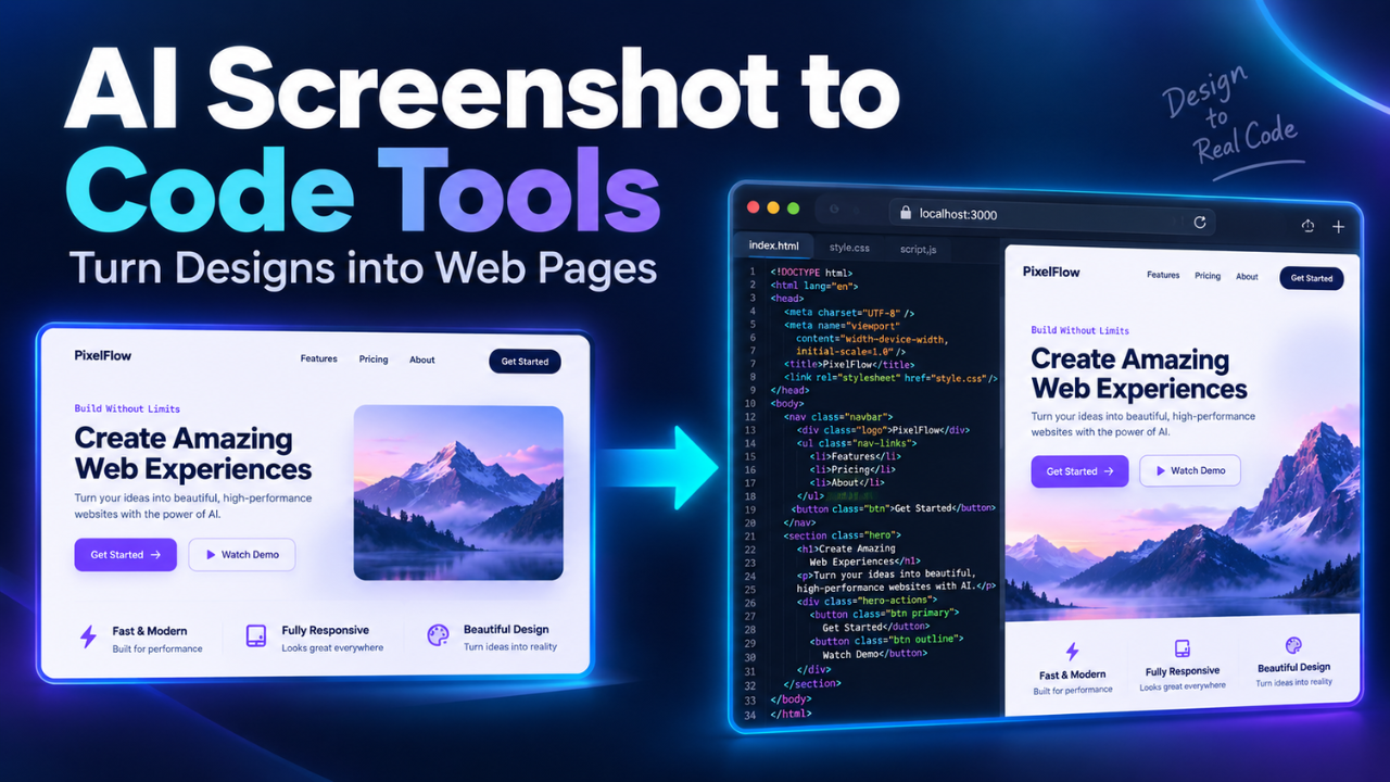
AI screenshot to code tools can give you a useful head start. They interpret a visual reference and generate the code needed to recreate its layout, typography, colors, and other visible elements.
The appeal is obvious. You can get something into a browser quickly, then spend your time improving it. But there’s a catch: a page that looks convincing isn’t necessarily ready for visitors.
Choosing the right tool starts with understanding that difference.
Table of Contents
- What Screenshot to Code Tools Actually Do
- Three Tools Worth Comparing
- Where These Tools Save the Most Work
- Give the Tool More Than a Picture
- Why a Good Match Can Still Be a Bad Page
- How to Review the Generated Code
- Choosing a Tool Without Wasting Money
- Start Small and Build Something You Can Maintain
What Screenshot to Code Tools Actually Do
A screenshot contains pixels. It doesn’t contain the original HTML, style rules, component structure, or application logic.
Screenshot to code software studies those pixels and builds a possible implementation. It identifies things that resemble headings, buttons, images, columns, and menus, then produces code to arrange them.
That distinction matters. These tools reconstruct a design; they don’t recover its original source code.
Imagine a screenshot showing three pricing cards. A generator might recreate the cards with matching colors and spacing. However, the picture doesn’t explain whether the prices change when someone selects annual billing.
It also can’t show what happens after a visitor clicks “Choose plan.”
Those details need instructions and implementation. Even when a tool can build the surrounding application, a single image doesn’t provide enough information to define its behavior.
Think of the screenshot as the visual brief. You still need to supply the rules.
Three Tools Worth Comparing
Different tools suit different projects. Some focus on converting images into frontend code, while others use screenshots as the starting point for a larger application.
Screenshot to Code: For a Focused Conversion Workflow
The open-source Screenshot to Code project supports several output options, including HTML with CSS, HTML with Tailwind, React with Tailwind, and Vue with Tailwind. It offers a hosted version as well as a local setup. The local version requires a frontend, a backend, and model-provider credentials. Screenshot to Code documentation
I’d put this on the shortlist when the main job is recreating an interface and you want a clear choice of output format.
For example, a simple promotional page may only need HTML and CSS. Generating an entire application framework for that job could create unnecessary maintenance.
The open-source route also gives developers room to customize the workflow. Just remember that running the software locally involves setup, and external model usage can still carry costs.
v0: For Developing a Visual Reference into an Interface
v0 accepts visual references and supports building interfaces from screenshots or Figma files. It also provides code editing and GitHub connectivity, allowing work to continue beyond the initial design. v0 documentation
That makes it worth considering when a screenshot represents the beginning of a project rather than a single conversion task.
Suppose you have a dashboard mockup. After recreating the screen, you may want to add a settings page or adjust the navigation across several views.
The practical question is whether the resulting code fits your project. Check the generated framework, dependencies, and component structure before committing to a larger build.
Bolt: For Continuing into a Browser-Based Project
Bolt supports attaching files, including images, to project conversations. Its documentation explains how attachments provide context and how uploaded images can become project assets. Bolt file attachment guide
For screenshot-led work, clearly explain that the image is a layout reference. Otherwise, “use this image” leaves room for a very different interpretation.
A useful scenario is a booking-page mockup that needs a working form next. You can establish the appearance, then define the fields and interactions.
Keep those stages manageable. Asking for a faithful recreation, user accounts, payment handling, and an admin area together makes it harder to see where problems begin.
Where These Tools Save the Most Work
The biggest opportunity is getting from a static reference to an editable first version.
Landing pages, pricing sections, navigation layouts, and simple dashboards are sensible starting points because much of their structure is visible. You can compare the result against the reference without needing to understand hidden business rules.
They can also make client feedback more useful.
A picture invites comments such as “make it feel cleaner.” A working page lets someone notice that the headline wraps awkwardly, the menu feels crowded, or the main button sits too low on a phone.
That’s a better conversation.
There’s also value in rebuilding your own older pages when the original design files are missing. A screenshot can provide a starting reference, although you’ll still need to recover or replace the actual content and assets.
The benefit becomes less predictable with complex workflows. A screenshot of a reporting screen reveals almost nothing about how its numbers are calculated.
Give the Tool More Than a Picture
A clear screenshot helps, but a short brief often makes the larger difference.
Crop out browser tabs, desktop backgrounds, and unrelated windows. Keep text readable. If the page is long, provide an overview plus closer views of detailed sections where the tool supports multiple attachments.
Then explain what you want built.
For example:
Recreate this pricing section using React and Tailwind. Display three columns on desktop and a single column on mobile. Make each plan a reusable component. The billing switch should update prices. Use the attached logo file.
That instruction covers structure, mobile behavior, component reuse, and functionality. The screenshot handles the appearance.
Supply original images and font names when you have them. A logo captured inside a screenshot may be too small to reuse cleanly. Font substitution can also change line breaks enough to throw off the whole layout.
If you already have a codebase, mention its existing components. Reusing your current button and form styles helps the new page belong to the same website.
Why a Good Match Can Still Be a Bad Page
Let’s be honest: the first preview can be persuasive. The colors look right, the cards line up, and the headline sits roughly where it should.
Then you narrow the browser.
A rigid layout may overflow. Long headings may collide with images. A menu that fits on desktop may leave no room for the page content on mobile.
A screenshot shows one size and one moment. A website needs to handle many.
The same problem appears with content. Three neat product names can hide a card layout that breaks when a real product title runs across four lines. Sample numbers don’t reveal how a table handles missing values.
Accessibility needs attention too. A visible label doesn’t guarantee that it’s correctly connected to a form field. Something styled like a button may lack keyboard behavior.
Ask for these requirements explicitly, then check them in the browser. Visual resemblance is only one part of a successful result.
How to Review the Generated Code
Start with the page’s structure before polishing tiny visual differences.
Check whether repeated elements share reusable components and whether headings follow a sensible order. Look for fixed widths or positioning rules that make the layout fragile.
Next, try the page with realistic content. Replace short placeholder text with actual headlines, longer names, and uneven descriptions. Test empty sections as well as populated ones.
Use every interactive element. Open menus, submit forms, switch tabs, and follow links. A button that changes color when clicked hasn’t necessarily completed the action its label promises.
Keyboard testing is useful: move through the page with Tab and check whether you can see your position and operate the controls.
For appearance, compare screenshots at the same browser width. Fix the biggest differences first—content width, typography, spacing, and image proportions. Small shadow adjustments can wait.
Before publishing, check loading behavior and the browser console for errors. The goal is a page that continues to work after the demo.
Choosing a Tool Without Wasting Money
Compare tools using the same small task.
Choose a reference with a navigation area, a few cards, and one meaningful interaction. Provide identical instructions, then judge the output by how much useful work remains.
Don’t measure only generation speed. A fast result loses its advantage if it takes hours to untangle.
Check code access, supported frameworks, revision limits, and usage charges before paying. Also confirm whether you can move the project into your normal development workflow.
For existing websites, compatibility deserves extra attention. A generated React page won’t automatically become an editable WordPress template. Integration may require additional development.
My preference would be the tool that produces understandable code with manageable cleanup. A slightly less impressive first preview can be the better choice if the finished page is easier to maintain.
Start Small and Build Something You Can Maintain
AI screenshot to code tools are most useful when you give them a clear, bounded job. Start with one section, provide the missing behavior, and inspect the result before expanding the project.
You’ll learn more from making one pricing block work properly than from generating ten unfinished pages.
The screenshot gives you a direction. The real value comes from turning that direction into a responsive, usable page that you can confidently change next month.





One Comment